
In today’s competitive digital landscape, design systems have emerged as the backbone of successful scalable UI design strategies. As startups and established companies alike race to build consistent, memorable brand experiences across multiple touchpoints, the implementation of robust design systems has become more critical than ever before.
What Are Design Systems and Why Do They Matter?
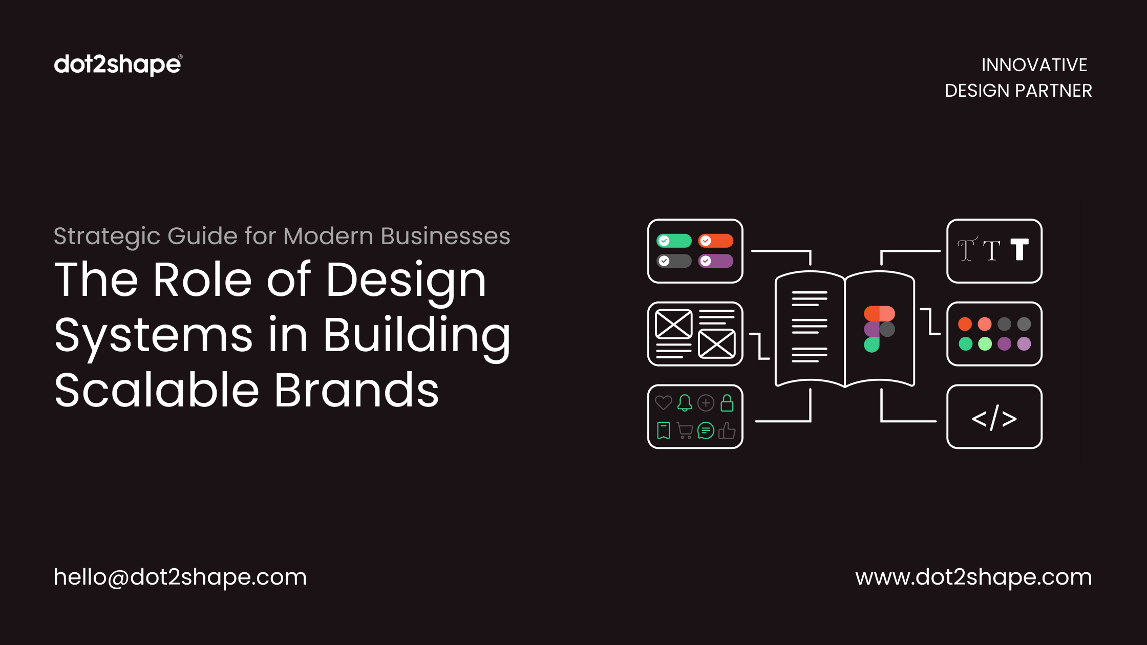
In short, a design system is a single source of truth for how a brand’s digital products look and behave. It combines design tokens (colors, type, spacing), reusable UI components (buttons, forms, cards), usage guidelines and code, so designers and developers build consistent interfaces faster across every product and platform.
Design systems are comprehensive collections of reusable components, guidelines, and standards that enable teams to build cohesive digital products at scale. Unlike traditional style guides, modern design system encompass everything from component libraries and design tokens to documentation and governance protocols.
For startup branding initiatives, design systems serve as the foundation for creating consistent user experiences while maintaining development efficiency. They bridge the gap between design intent and technical implementation, ensuring that every interaction reflects the brand’s core values and visual identity.
How do design systems help brands scale?
Design systems help brands scale by letting many teams ship new features without redesigning basics every time. Shared components cut design and development time, tokens keep the brand consistent across web and mobile, and documented rules reduce debates and rework. As products grow, the system keeps the experience coherent instead of fragmented.
Building a Scalable Branding Framework Through Design Systems
1. Establishing Brand Consistency Across Platforms
A well-structured branding framework built on design system ensures UI consistency across web applications, mobile apps, and marketing materials. This consistency is crucial for brand recognition and user trust, particularly for startups looking to establish market presence quickly.
Component libraries within design system standardize visual elements like buttons, forms, and navigation patterns. This standardization reduces design debt and accelerates the product development process while maintaining brand integrity across all customer touchpoints.
2. Accelerating Development Workflow and Team Collaboration
Modern design systems revolutionize development workflow by providing pre-built, tested components that developers can implement immediately. This approach significantly reduces time-to-market for new features and products, giving startups a competitive advantage in fast-moving markets.
Cross-functional collaboration improves dramatically when teams work from a shared design system. Designers, developers, and product managers can communicate more effectively using common terminology and established patterns, reducing miscommunication and iteration cycles.
3. Enabling Product Scalability and Growth
Product scalability becomes achievable when organizations implement comprehensive design systems. As companies grow and launch new products or enter new markets, having established design patterns and component libraries allows teams to maintain quality while scaling rapidly.
Design system governance ensures that as teams expand, new components and patterns align with existing brand guidelines. This scalability is particularly valuable for startup growth phases, where maintaining brand consistency during rapid expansion can be challenging.
What’s inside a design system?
Most design systems include:
- Design tokens for color, typography, spacing and radius
- A component library in Figma and in code
- Patterns for common flows such as sign-up and checkout
- Accessibility rules
- Brand and content guidelines
- Documentation plus a governance process for adding and changing components
For typography tokens, many teams now use variable fonts in their brand system to cover every weight with a single file.
Key Components of Effective Design Systems
Design Tokens and Visual Language
Design tokens form the atomic level of design systems, defining colors, typography, spacing, and other fundamental design decisions. These tokens ensure visual consistency across all brand applications and make global design updates efficient and systematic.
Component Libraries and Pattern Documentation
Robust component libraries include everything from basic UI elements to complex interaction patterns. Well-documented components reduce design system adoption barriers and enable teams to implement features quickly while maintaining brand standards.
Responsive Design Patterns
Modern design systems prioritize responsive design principles, ensuring consistent brand experiences across devices. This approach is essential for user experience optimization and supports diverse user needs in today’s multi-device world.
Design system examples
Some of the best-known public design systems show how different companies approach the same idea:
| System | Company | What it’s known for |
|---|---|---|
| Material Design | Cross-platform guidelines | |
| Carbon | IBM | Enterprise and data-heavy products |
| Polaris | Shopify | Merchant admin and content guidelines |
| Atlassian Design System | Atlassian | Collaboration tools |
| Human Interface Guidelines | Apple | Platform conventions |
Measuring Design System Success and ROI
Successful design system implementation delivers measurable business value through improved development efficiency, reduced design debt, and enhanced brand consistency. Organizations typically see significant improvements in feature delivery speed and design quality consistency within months of adoption.
Design system metrics should include component adoption rates, design-to-development handoff efficiency, and brand consistency scores across products. These measurements help justify continued investment in design system maintenance and evolution.
Implementation Strategy for Startups and Growing Companies
Starting with a minimal viable design system allows organizations to realize immediate benefits while building toward more comprehensive solutions. Startup design strategy should focus on establishing core components and patterns that support immediate business needs while planning for future scalability.
Design system adoption requires organizational commitment beyond the design and development teams. Success depends on establishing clear governance, providing adequate training, and demonstrating value to stakeholders across the organization.
How much does it cost to have an agency build a design system?
Cost depends on how many products and platforms it covers, how many components are needed, whether it includes coded components or only Figma, and how much documentation is required. A focused starter system for one product is far smaller than an enterprise system for several apps. For a quote scoped to your product, see our design system services.
As a guide, these are the typical ranges for a design system built by Dot2Shape:
| Package | What it covers | Typical timeline | Typical price |
|---|---|---|---|
| Starter system | One product, Figma only: design tokens, 20–30 core components and basic usage guidelines | 3–5 weeks | $6,000–$12,000 |
| Growth system | Web and mobile: Figma library plus coded components, patterns for key flows and accessibility rules | 6–10 weeks | $15,000–$35,000 |
| Enterprise system | Several products or brands, full documentation site, governance process and team onboarding | 12+ weeks | $40,000+ |
Final pricing depends on scope, so every project starts with a short discovery call and a fixed proposal.
Future-Proofing Your Brand Through Design Systems
As digital transformation continues reshaping business landscapes, design systems provide the foundation for adapting to new technologies and user expectations. Companies with mature design systems can more easily integrate emerging technologies like AI interfaces or voice interactions while maintaining brand consistency.
Design system evolution should anticipate future needs while serving current requirements. This forward-thinking approach ensures that initial investments in design systems continue delivering value as organizations grow and market conditions change.
Frequently Asked Questions (FAQs)
Q: What is the difference between a design system and a style guide? A:
A design system is a comprehensive collection of reusable components, patterns, and guidelines, while a style guide typically focuses only on visual elements like colors and fonts. Design systems include component libraries, code examples, and implementation guidelines.
Q: How long does it take to implement a design system?
A: Design system implementation typically takes 3-6 months for basic systems, with ongoing evolution continuing indefinitely. Startup design systems can start smaller and grow incrementally with business needs.
Q: What are the main benefits of design systems for startups?
A: Design systems help startups achieve brand consistency, accelerate product development, improve development workflow, and enable product scalability while maintaining quality during rapid growth phases.
Q: How do design systems improve development efficiency?
A: Component libraries and standardized patterns reduce code duplication, minimize design-development communication overhead, and enable faster feature implementation through reusable elements.
Q: What tools are best for building design systems?
A: Popular design system tools include Figma for design, Storybook for component libraries, and platforms like Zeroheight for documentation. The choice depends on team size, technical requirements, and development workflow preferences.
Q: How do you measure design system success?
A: Key metrics include component adoption rates, design-to-development handoff time, brand consistency scores, and overall development efficiency improvements. Regular audits help track design system ROI.