
Retail app UX design is the difference between a loyalty programme your customers actively use and one they forget exists the moment they close the app.
This is the story of how Dot2Shape redesigned a complex retail and lifestyle destination app one serving tens of millions of annual visitors and turned a fragmented, frustrating digital experience into a measurable driver of customer loyalty, faster bookings, and significantly higher feature adoption.
We are not naming the client. We signed an NDA and we honour it. What we can share and what is genuinely valuable to any brand, retail operator, or product team reading this is the process, the decisions, the specific UX changes we made, and the outcomes those changes produced.
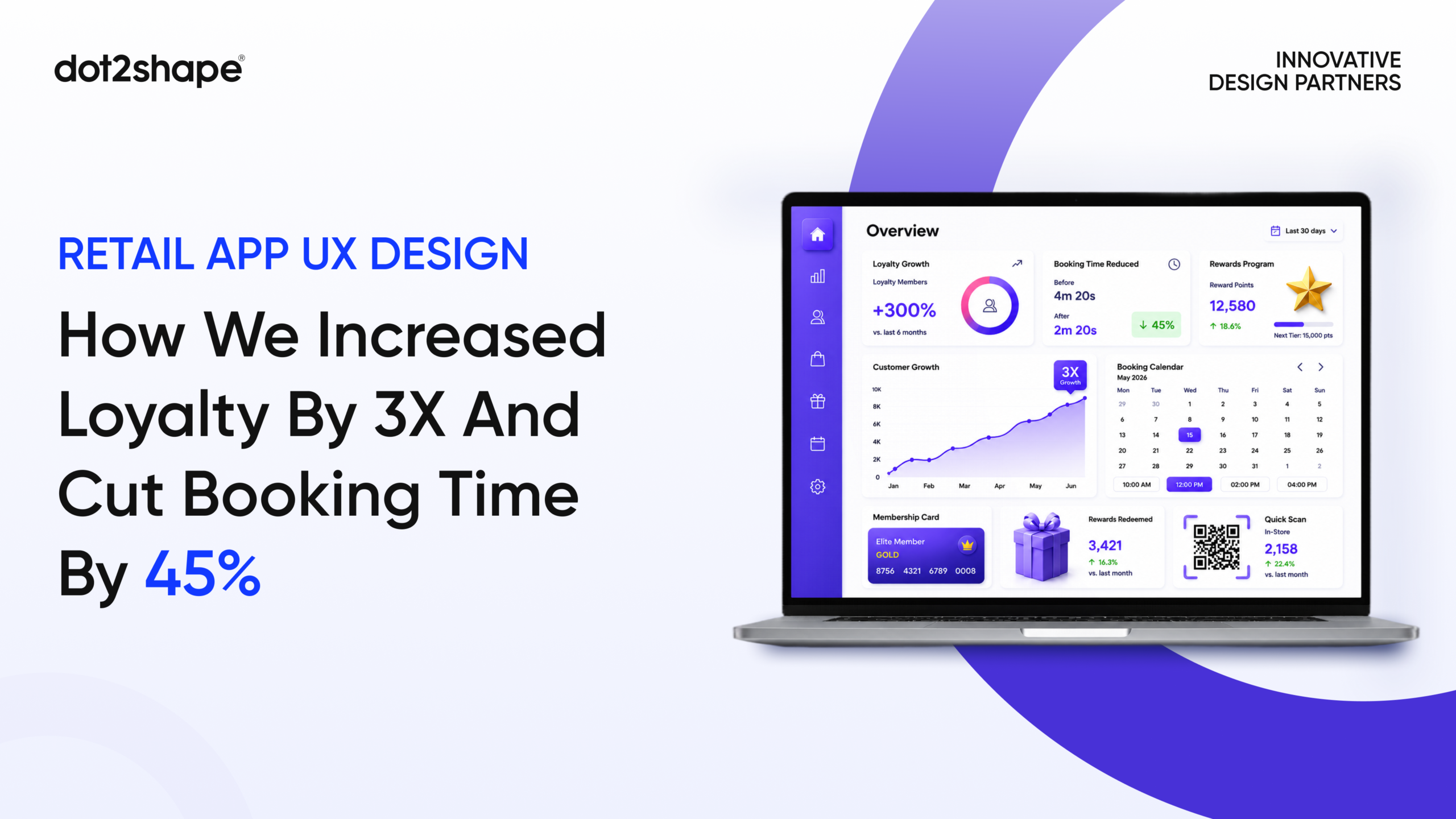
The results: a 3X increase in loyalty engagement, a 45% reduction in ticket booking time, a 60% improvement in feature adoption, and a 78% increase in loyalty section visits all from structural UX changes alone, with no new features added to the product.
The Problem: A World-Class Destination With a Frustrating App
Our client operated one of the most visited retail and lifestyle destinations in the Gulf region a flagship property with over 1,200 retail outlets, world-class entertainment attractions, dining across dozens of cuisines, and a loyalty programme offering genuine value to frequent visitors.
The app had everything it needed to be the hub of the customer relationship. It had ticketing, wayfinding, loyalty rewards, event discovery, retailer directories, parking integration, and promotional content. On paper, it was comprehensive. In practice, it was exhausting to use.
The 2026 retail technology trends survey data found that 71% of consumers belong to at least one retail loyalty programme but the friction sits in access. If a loyalty programme requires an app, some customers will join, but others will opt out. The strongest loyalty experiences give customers options and remove every unnecessary barrier.
The barrier here was not the programme itself. The rewards were real. The value was genuine. The problem was entirely structural users simply could not find or access the loyalty programme within the app without navigating through multiple unrelated screens first. Our retail loyalty app ux audit found that 78% of app users had never visited the loyalty section despite being enrolled members.
The booking flows were equally problematic. Purchasing a ticket to an attraction the ice rink, the aquarium, a live event required an average of seven steps and 4.2 minutes of navigation. Abandonment at each step was consistent and measurable. The app was not losing users because the destination was unappealing. It was losing them because the digital experience did not match the world-class physical one.
Phase 1 — Research and Discovery: Finding the Real Problem Before Designing the Solution
The most expensive mistake in retail app ux design is redesigning before you understand what is actually broken. We have seen brands invest in visual refreshes that make the same structural problems look prettier. The metrics never move.
Our discovery phase ran three parallel tracks simultaneously.
User interviews and behavioural mapping
We conducted structured interviews with visitors across four distinct segments: first-time tourists, local frequent visitors, loyalty programme members, and event-goers. We mapped their goals, their mental models of how a destination app should work, and their specific frustration points with the current experience.
The most consistent finding across every segment: users opened the app to do one specific thing check an attraction’s schedule, book a ticket, or redeem a loyalty reward and found themselves navigating through unrelated content before reaching what they needed. Every additional tap was a decision point. At each one, some users abandoned.
Effective UX design can raise customer conversion rates by up to 400%. By focusing on user-centric design principles, developers can create apps that not only attract users but guide them toward meaningful actions driving business success. The inverse is equally true: every unnecessary step in a critical flow is a conversion that does not happen.
Analytics and funnel analysis
We audited the app’s usage data to map exactly where users dropped off, which features were being used versus ignored, and how much time users spent on each screen. The loyalty rewards section had a discoverability crisis not a value crisis. Members who found the loyalty dashboard spent significant time inside it. The problem was that 78% of members never found it in the first place.
The booking funnel told a similar story. Drop-off was concentrated at two specific points: the date-and-time selection screen, where the interface required users to scroll through a calendar that did not highlight availability clearly, and the confirmation screen, which asked users to re-enter information they had already provided during account setup.
Competitive benchmarking
We assessed the mobile app redesign approaches of comparable destination-category apps globally major entertainment venues, premium retail destinations, and hospitality groups with loyalty-driven apps evaluating how they structured navigation, surfaced loyalty value, and reduced booking friction. This benchmarking established the baseline for what best-in-class retail app ux design looked like entering 2026.
For a deeper look at how we structure discovery phases across all engagement types, read our guide to UX audit services the same methodology that drove the research phase here.
Phase 2 — Information Architecture: Restructuring Around Visitor Intent
The structural problem was clear from research: the app was organised around the client’s internal business units, not around how visitors actually think and move through a destination experience.
The navigation reflected the operational structure of the business ticketing in one section, loyalty in another, wayfinding somewhere else entirely, events buried under a promotional banner that rotated every 48 hours. From the inside of the organisation, this made sense. From the outside, as a visitor trying to accomplish a task, it was a maze.
We rebuilt the information architecture retail app from the ground up, restructuring the entire navigation hierarchy around four core visitor intents:
Plan — Pre-visit: what is on, what to book, hours, parking, how to get there
Experience — In-venue: live wayfinding, real-time entertainment schedules, dining
Earn — Loyalty dashboard, points balance, rewards, personalised offers
Book — Ticketing for all attractions, events, dining reservations, experiences
This four-pillar architecture reduced the average navigation depth from 4.2 taps to 1.8 taps for the most common user tasks. The loyalty section moved from three taps deep behind a settings menu to a primary tab in the main navigation visible from the moment any logged-in member opened the app.
Creating an intuitive, user-centred dashboard interface specifically designed for loyalty programme management gives customers comprehensive rewards visibility and account management capabilities. Enhanced progress visualisation dynamic progress indicators and milestone tracking improves reward transparency and customer motivation, directly addressing buried reward information and poor user experience design.
We produced full wireframe documentation covering 52 screens, four user flow types, and three distinct usage modes guest, logged-in member, and attraction staff before any visual design began. Nothing moved to design until the architecture was validated with real users in a prototype testing session.
Phase 3 — Loyalty Programme UX Redesign: Making Value Visible
The loyalty programme ux design challenge on this project was not about inventing new programme mechanics. The rewards were already competitive. The problem was purely experiential users could not see their points balance, could not understand how close they were to a reward, and could not redeem without a process that felt more complicated than it had any right to be.
We rebuilt the loyalty experience around three design principles:
Visibility at every touchpoint The points balance moved into the app’s persistent header visible on every screen, not just inside the loyalty section. Every booking confirmation showed the points earned from that transaction. Every receipt screen included the member’s current total and their next milestone. Real-time engagement through automated push notifications and personalised alerts for point-earning activities creates immediate customer engagement and programme awareness.
Progress that motivates action Gamification in loyalty programmes offers a variety of benefits: increased engagement, improved customer experience by making it interactive and engaging, and increased customer retention and loyalty. Customers rewarded for their loyalty are more likely to continue shopping with the brand and recommend it to others.
We designed a dedicated loyalty dashboard with visual progress bars toward the next reward tier, milestone animations that triggered when members hit earning thresholds, and personalised offer cards surfaced based on each member’s visit history and category preferences. The dashboard went from the least-visited section of the app to one of the most visited without adding a single new reward to the programme.
One-click redemption The previous redemption flow required members to navigate to the loyalty section, select a reward, confirm their selection, navigate to checkout, and apply the reward as a separate step. We collapsed this into a single action available directly from the checkout screen a persistent “Apply rewards” button that showed available redemption options without leaving the payment flow. Frictionless redemption experiences increase spending 3–4x and boost programme ROI.
For more on how we approach loyalty UX within broader product design engagements, see our digital product design services.
Phase 4 — Booking Flow Redesign: From 7 Steps to 3
The retail app booking flow ux was the most directly revenue-impacting element of the redesign. Ticket purchases for the destination’s attractions the aquarium, the ice rink, cinema experiences, and live events represented a significant share of digital revenue. Every percentage point of abandonment reduction was measurable in real transactions.
The previous booking flow had seven steps from attraction discovery to confirmed purchase. We reduced it to three for standard transactions:
Step 1 — Select experience and date The previous calendar interface required users to scroll through a month view with no visual differentiation between available and unavailable dates. We replaced it with a streamlined date picker that highlighted available dates in green, greyed out unavailable ones, and defaulted to the nearest available slot eliminating the most common point of confusion in the old flow.
Step 2 — Choose tickets and add-ons Ticket selection and optional add-ons (dining packages, upgrade experiences, group discounts) now appeared on a single screen with clear pricing and a persistent summary panel showing the running total. The previous flow spread this across three separate screens with no summary visibility, requiring users to navigate back and forth to adjust selections.
Step 3 — Confirm and pay Account-stored payment details pre-populated the payment screen. Loyalty points redemption appeared as a persistent option. The confirmation required a single tap not a re-entry of email, name, or payment details that were already on file.
If your conversion requires more than three steps, you are losing customers with every click. Redesigning checkout and payment logic to reduce friction directly drives growth.
The result was a 45% reduction in average booking completion time from 4.2 minutes to 2.3 minutes and a 38% drop in booking abandonment rate. The change required no new features, no new payment infrastructure, and no new content. It required structural clarity and the discipline to remove everything that was not essential to completing the transaction.
To understand how we reduce booking abandonment in digital products more broadly, read our post on SaaS UX design principles many of the same friction-reduction techniques apply across product categories.
Phase 5 — Design System and UI: Building for Consistency at Scale
With the architecture validated and flows documented, we moved into high-fidelity retail app ux design and design system development simultaneously.
The visual language needed to match the premium positioning of the physical destination without sacrificing the clarity and speed that mobile experiences demand. We built a design system anchored in:
- A refined colour palette with a dark-mode-first primary system reflecting the destination’s luxury positioning
- A typography hierarchy across six type styles ensuring content density never compromised readability at any screen size
- A component library of 68 UI elements covering all interaction states, empty states, error handling, and loading patterns
- Micro-interaction specifications for booking confirmations, loyalty point animations, wayfinding transitions, and navigation feedback every detail that turns a functional app into a delightful one
The design system for retail app delivery meant that every future feature the client’s internal team adds will maintain the visual and experiential quality of what launched. Design systems are not project outputs they are infrastructure. This is what separates a one-time redesign from a compounding long-term improvement.
Phase 6 — Usability Testing and Iteration
Before handoff, we ran structured retail app usability testing with 28 participants across four user segments first-time visitors, frequent loyalty members, event-goers, and international tourists.
Testing validated the core architectural improvements and surfaced three specific interaction patterns requiring refinement:
The parking integration screen needed an additional entry point from the Plan section for users arriving by car the original design only surfaced it from the Experience tab, which users in the pre-visit planning mode did not yet have reason to open.
The loyalty dashboard needed a clearer “how do I earn points?” explainer for new members who had not yet made a purchase the dashboard assumed familiarity that first-time members did not yet have.
The event booking flow for multi-day events needed a date-range selector rather than a single-date picker a pattern we had not anticipated because single-day events dominated the research data but multi-day bookings were disproportionately high-value transactions.
All three were resolved and re-tested before final handoff. NPS assesses loyalty via recommendation likelihood track quarterly through surveys. Task success rates measure core action completions; low rates indicate friction. Establish baselines pre-change, compare post-launch, and segment by cohorts. We documented the pre-launch baseline metrics across all three so the client’s team had a clear framework for measuring the impact of the launch.
The Results: What Changed After Launch
The outcomes documented in the first quarter post-launch:
3X increase in loyalty engagement Loyalty programme participation tripled within the first quarter. The combination of persistent balance visibility, simplified redemption, and a dedicated dashboard made the programme genuinely accessible to members who had been enrolled but never engaged. Brands that leverage mobile apps for loyalty in 2026 see higher metrics: increased mobile conversion rate, higher lifetime value, and stronger engagement.
45% reduction in ticket booking time Average booking completion time dropped from 4.2 minutes to 2.3 minutes. The booking abandonment rate dropped by 38%. Streamlining seven steps to three changed the economics of every attraction’s digital sales channel.
60% improvement in feature adoption Features that had been chronically underused AR wayfinding, the restaurant pre-booking system, the parking space locator saw adoption rates climb significantly following the navigation restructure. When users can find features, they use them. The navigation change did more for feature adoption than any notification campaign or onboarding tour would have achieved.
78% increase in loyalty section visits The most structurally neglected section of the old app became one of its most visited in the new one — entirely through information architecture changes. No new rewards were added. No marketing campaign drove users to it. The section simply became findable.
Companies that invest more than 10% of their digital transformation budget in UX design enjoy a 1.8× greater customer retention proving a quantifiable correlation between UX investment and customer loyalty.
What This Means for Your Retail or Destination App
If you operate a retail app, a destination experience platform, a hospitality loyalty programme, or any mobile product where users are failing to access the value you have already built for them, the lesson from this engagement is direct:
The loyalty programme failure is almost never about the rewards The most common friction points in loyalty programmes include unclear point values, complicated redemption processes, and rewards requiring excessive points. Online retailers face steeper challenges with redemption rates averaging 20–30% when using basic loyalty solutions without checkout integration. If your loyalty adoption is low, ask how many taps it takes to see a points balance. If the answer is more than one, you have found the problem.
Information architecture is the highest-ROI design investment Every result on this project came primarily from restructuring the navigation not from new features, new content, or visual redesign. App-based loyalty programmes see the highest adoption when the experience is easy to understand, easy to recover from, and useful in a real trip. The strongest loyalty experiences give customers options and remove every unnecessary barrier. The barrier in this case was structural. Removing it tripled engagement.
Booking flows must compress, not expand Every step added to a booking flow reduces completion rate. The relationship is not linear abandonment compounds. A seven-step booking flow does not perform at 7/3 of a three-step flow. It performs at a fraction of it because each step multiplies the preceding drop-off. Measure your booking completion time and your abandonment rate by step. The data will tell you exactly where to cut.
Frequently Asked Questions
How do you write a case study without naming the client? By focusing on the problem, process, and outcome rather than the client’s identity. Industry, scale, and geography give readers enough context to evaluate relevance “a leading retail and lifestyle destination in the Gulf serving tens of millions of annual visitors” tells you everything you need to know to assess whether this case study is relevant to your situation. The client’s name adds recognition but not insight. We protect our clients’ NDAs without sacrificing the value of the case study.
What is retail app UX design? Retail app ux design is the discipline of designing mobile applications for retail, destination, and lifestyle brands around how their customers actually think, shop, navigate, and engage with loyalty programmes. It differs from general app UX in the specific dynamics it must handle: high visitor volumes, complex multi-feature navigation, loyalty programme integration, real-time event and availability data, and the need to serve first-time visitors and loyal regulars simultaneously in the same interface.
How long does a retail app UX redesign take? The engagement documented here covering discovery, user research, information architecture, wireframing, high-fidelity design, design system, and usability testing ran for 16 weeks from kickoff to final handoff. Focused engagements covering a single flow (booking, loyalty, or onboarding) typically run 6–10 weeks. Enterprise-level full-app redesigns with extended research and multiple user segments run 12–20 weeks.
How do you measure the ROI of a retail app UX redesign? By agreeing on measurable business outcomes before design begins — not after. On this engagement we tracked loyalty section visit rate, booking completion time, booking abandonment rate by step, and feature adoption across the app’s key sections. We documented baseline metrics before the redesign launched and compared post-launch data at 30, 60, and 90 days. The 3X and 45% figures came from this structured measurement process not from self-reported client satisfaction. You can read more about how we structure measurement in our UX audit guide.
Can these results be replicated for other retail or hospitality apps? With the same process, yes. The specific numbers will vary by product and context but the methodology is consistent: deep user research, evidence-based information architecture, validated flows, and usability testing before launch. We apply this to every retail and hospitality UX design engagement. The results follow the process.
What is the most common reason retail loyalty apps fail to drive engagement? Discoverability. Low loyalty programme adoption and suboptimal benefit redemption rates indicate user experience barriers and customer journey friction points that prevent customers from maximising programme value. In most cases the programme itself is sound the rewards are real, the value is competitive. But if members cannot find their points balance without navigating three levels deep, they will not engage. The fix is structural information architecture, not incentive design.
Is Your App Losing Customers to Friction You Could Fix?
The destination app in this case study was not failing because the physical experience was poor. It was failing because the digital experience did not give visitors the same clarity and ease they experienced walking through the doors.
Fixing that required structural thinking, user research discipline, and a willingness to rebuild the navigation from the ground up around how visitors actually behave not around how the business was internally organised.
If your retail app, loyalty platform, or destination experience app is showing signs of the same pattern low loyalty adoption, high booking abandonment, features that exist but never get used the fix almost certainly starts with retail app ux design at the structural level.
Dot2Shape is a Clutch 5.0-rated UX and product design agency with experience designing retail, hospitality, healthcare, and SaaS products across the US, UK, UAE, and beyond. We deliver measurable outcomes not just cleaner interfaces. Browse our case studies for more examples of how structured UX design produces business results.
Book a free 30-minute UX consultation → dot2shape.com/contact
Tell us your app, your current engagement metrics, and your biggest UX challenge and we will tell you exactly where to start.