
Your developer just rebuilt the same button for the fourth time this month.
A slightly different border radius. A marginally different shade of blue. A hover state that does not quite match the one three screens over. Nobody planned this. Nobody wanted it. But without a shared foundation to build from, it happens on every sprint silently draining time, money, and the visual consistency that makes a product feel trustworthy.
This is precisely the problem that a design system agency solves. And for startups scaling their product and team, it is one of the highest-return investments available not in more features, not in more marketing, but in the infrastructure that makes everything you already build faster, cheaper, and significantly more consistent.
In this guide we explain exactly what a design system is, break down every design system component, show you the real cost savings backed by hard data, and walk through how Dot2Shape builds design systems for startups that eliminate the hidden productivity tax of inconsistency in growing product teams.
What is a Design System? (And What It is Not)
A design system is a single, centralised collection of reusable components, design decisions, and documentation that gives your entire team designers, developers, and product managers one shared language for building your product.
Think of it as the living rulebook and toolkit for your product’s UI. Instead of every designer making independent decisions about spacing, colour, typography, and button states and every developer rebuilding the same elements from scratch a design system agency makes those decisions once, documents them clearly, and makes them reusable across your entire product.
A system built in Figma can support a designer making components, a product lead reviewing a flow, a stakeholder commenting on a prototype, and a developer inspecting spacing and tokens all without leaving the same source file.
A design system is NOT just a style guide. It is NOT a UI kit. It is NOT a Figma file with some saved colours. A style guide covers visual rules. A design system is the full operating infrastructure design tokens, component library, interaction patterns, accessibility guidelines, content principles, and developer handoff documentation all maintained in one version-controlled source of truth.
The Real Cost of NOT Having a Design System
Here is where the $50,000 figure comes from and for many growing startups, it is actually conservative.
Forrester and Medium analysis indicates a 30–50% reduction in design and development costs for teams using mature design systems.
To understand why, look at what the absence of a design system costs in practice across a typical 4-person engineering team:
Duplicated component work Without a UI component library for startups, every developer builds the same modal, the same dropdown, the same notification toast independently. One simple component like a modal takes 3 days to design, build, and test. If multiple squads each build it separately, that is 150 days of lost time across a team. At a blended developer rate of $50/hour, that is tens of thousands of dollars spent rebuilding what already exists.
Design inconsistency bugs When designers work without shared design tokens, screens drift visually. Buttons look different on mobile and desktop. Spacing varies between pages. These are not purely aesthetic problems they erode user trust and generate engineering time to debug and manually align.
Slow team onboarding Every new designer or developer must reverse-engineer your product’s patterns from scratch. A design system for startups compresses weeks of onboarding into days because the decisions are already documented and accessible.
Rebrand and redesign debt Without a design system, updating your brand means touching every component across every screen manually. With one, you update a token and changes propagate automatically.
Validating designs before development allows teams to reduce iteration cycles by 25%, effectively avoiding millions in wasted developer rework costs.
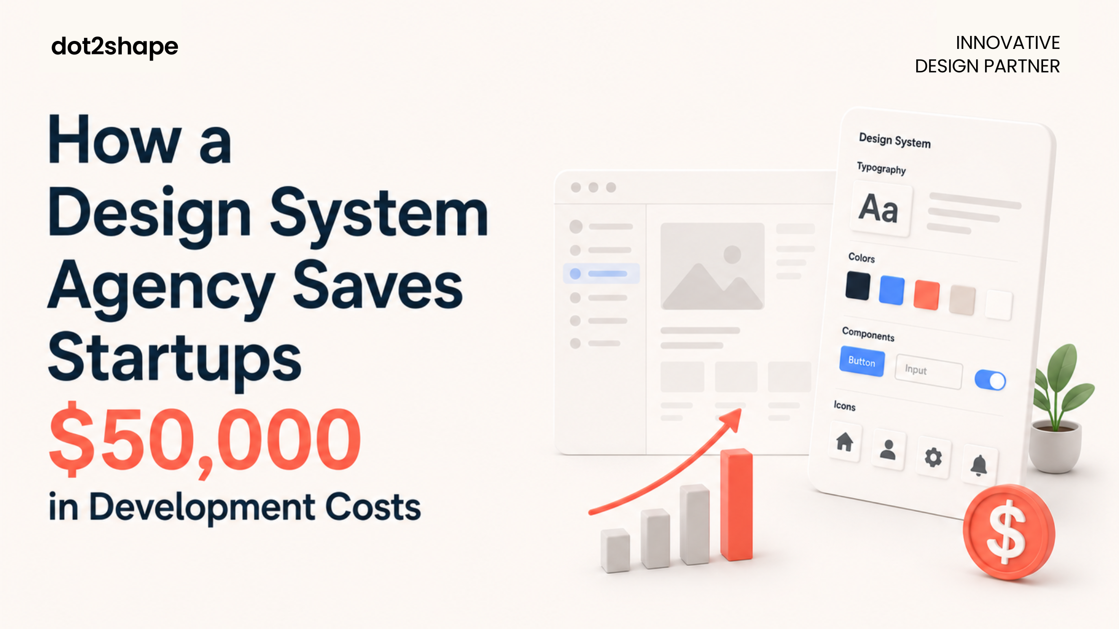
What Goes Inside a Design System? All Components Explained
A professional design system built by an experienced design system agency contains seven core layers. Here is what each one does:
1. Design Tokens Design tokens explained simply: they are the atomic values that define your visual language colours, spacing scales, typography sizes, border radii, shadow values, animation durations. Tokens are the DNA of your product’s visual consistency. When a token changes, every component referencing it updates automatically.
2. Component Library The component library is the heart of your design system every reusable UI element: buttons in all states, form inputs, modals, navigation bars, cards, badges, tooltips, dropdowns. Built once, tested once, reused everywhere. Grammarly ran an internal survey and found that their design system saved design and development teams 25% of their work week.
3. Layout and Grid System Consistent spacing and layout rules column grids, margin scales, breakpoint definitions ensure your product looks intentional at every screen size. Without these, designers make different spacing decisions per screen and developers hard-code values that break on mobile.
4. Typography System A defined type scale covering H1–H6, body text, captions, labels, and display text with defined sizes, weights, line heights, and letter spacing for each. This prevents the “17 slightly different font sizes” problem that plagues products built without a design system.
5. Interaction and Motion Patterns Consistent micro-interactions how modals appear, how tooltips fade, how error states animate make your product feel polished. Documented once, implemented consistently by developers without a designer present for every decision.
6. Accessibility Guidelines A production-ready design system bakes in accessibility from the start WCAG AA colour contrast ratios, keyboard navigation patterns, ARIA label guidelines, and visible focus states. 75% of organisations report that their digital accessibility efforts have directly improved revenue.
7. Developer Handoff Documentation This is where a design system becomes a true bridge between design and engineering. Dev Mode in Figma provides developers with code snippets, measurements, tokens, and usage guidelines directly removing the need for back-and-forth handoff cycles. Developers pull production-ready specs into their builds. Faster shipping, fewer design-to-implementation mismatches, and dramatically less time lost in review.
How to Build a Design System — Our Process at Dot2Shape
Building a design system for startups is fundamentally different from building one for an enterprise. Startups need speed, pragmatism, and a system that scales as the product grows not a six-month behemoth that is outdated before it ships.
Here is how Dot2Shape approaches every design system engagement:
Phase 1 — Audit and Inventory (Week 1) Before building anything new, we audit your existing product. We catalogue every UI element currently in use buttons, inputs, cards, type styles and identify inconsistencies, duplicates, and gaps. This audit defines the scope: standardise what exists, build what is missing.
Phase 2 — Token Architecture (Weeks 1–2) We define your design token structure: primitive tokens (raw values), semantic tokens (how they are used in context), and component tokens (how components reference semantic tokens). This three-tier structure makes your Figma design system scalable and maintainable as the product evolves over years.
Phase 3 — Component Build (Weeks 2–5) We build your UI component library in Figma starting with the highest-frequency components (buttons, inputs, navigation) and working through complex patterns (data tables, modals, empty states, notifications). Every component is built with variants, states, and Auto Layout not static screenshots.
Phase 4 — Documentation and Handoff (Weeks 5–6) Every component is documented with usage guidelines, prop definitions, accessibility notes, and code snippets. Teams utilising integrated design-to-code workflows see a 30% time recovery for developers who no longer have to translate generic design specs into component props.
Phase 5 — Team Training and Adoption (Week 6) A design system only delivers ROI if the team uses it consistently. We run a structured training session covering how to use the library, how to request new components, and how to maintain design consistency for SaaS products as the codebase and product evolve.
Case Study: How We Built a Design System That Increased Sprint Velocity by 40%
A SaaS client came to Dot2Shape after 18 months of rapid growth had created a product with four different button styles, three inconsistent colour palettes, and a mobile experience that did not visually match desktop.
Their engineering team was spending approximately 30% of every sprint correcting visual inconsistencies bugs that should not have existed.
We delivered a complete Figma design system in six weeks:
- Token architecture: 120+ tokens covering colour, spacing, typography, and motion
- Component library: 80+ components with full variant sets and Auto Layout
- Interaction documentation: animation guidelines for all transitions and feedback states
- Developer handoff: full Dev Mode integration with production-ready code snippets
Results after adoption:
- Sprint velocity increased by 40% in the first quarter
- Visual inconsistency bugs dropped by over 80%
- New designers onboarded in 2 days instead of 2 weeks
- Developer handoff time reduced from 3 days to 4 hours per feature
This is the compounding return of investing in a design system early not just cleaner UI, but measurably faster, cheaper product delivery.
When Does a Startup Need a Design System?
The honest answer: earlier than most founders think. Here are the clearest signals:
You have more than one designer on the product The moment two designers make independent decisions about the same UI patterns, visual drift begins compounding. A shared design system for startups eliminates this from day one.
Your engineers ask the same design questions repeatedly “What is the correct border radius?” “Which blue is the primary colour?” “How should this error state look?” These are not engineering failures they are symptoms of a missing design system.
You are scaling the team Every new hire designer or developer who joins without a design system to reference adds onboarding debt. A design system is the single fastest way to bring new team members up to speed.
You are preparing for Series A or B Enterprise buyers and investors evaluate product quality as a signal of company maturity. A polished, consistent UI built on a design system signals that your team builds with intention, not improvisation.
You are planning a redesign or rebrand Without a design system, a rebrand touches every screen manually. With one, you update tokens and propagate changes automatically across the entire product. Reducing development costs with a design system is nowhere more visible than during a rebrand.
Design System vs Style Guide — What is the Actual Difference?
Almost every client asks this at the start of a design system engagement.
A style guide defines visual rules colours, typography, logo usage but contains no reusable components, interaction patterns, code specifications, or developer handoff documentation. It is a document. A design system is living infrastructure.
| Style Guide | Design System | |
| Visual rules | ✅ | ✅ |
| Component library | ❌ | ✅ |
| Design tokens | ❌ | ✅ |
| Interaction patterns | ❌ | ✅ |
| Developer handoff | ❌ | ✅ |
| Maintained and versioned | Rarely | Always |
| Scales with the product | ❌ | ✅ |
A style guide tells your team what your brand looks like. A design system tells your entire organisation how to build it consistently, at speed, every time.
How Much Does Design System Development Cost?
Design system development cost in 2026 ranges based on product size, component count, and documentation depth:
Starter Design System — $5,000–$10,000 Core component library of 30–50 components, basic design token architecture, Figma library setup. Best for early-stage startups shipping their first product.
Growth Design System — $10,000–$25,000 Full library of 60–100 components, complete token architecture, interaction documentation, accessibility review, and developer handoff. Best for Series A startups scaling their product team.
Enterprise Design System — $25,000–$60,000+ Multi-brand system with 100+ components, full code integration, Storybook documentation, governance framework, and team training programme. Best for enterprise products or organisations managing multiple product lines.
Companies see a return on investment of up to 135% within just a few years of implementing a robust design system. The investment question is not whether you can afford one — it is how long you can sustain the hidden cost of building without one.
At Dot2Shape, all design system engagements are fixed-price with scope agreed before work begins.
Frequently Asked Questions
What is a design system in simple terms? A design system is a shared library of reusable UI components, documented design rules, and developer handoff documentation that your entire product team uses to build consistently and efficiently. It replaces scattered, inconsistent decisions with one centralised, maintained source of truth.
What is the difference between a design system and a style guide? A style guide covers visual rules only colours, fonts, logo usage. A design system agency includes all of that plus reusable design system components, design tokens, interaction patterns, accessibility standards, and developer code specifications. A style guide is a document. A design system is living product infrastructure.
When does a startup need a design system? As soon as you have more than one person building your product UI. The earlier you invest in a design system for startups, the less rework accumulates. Most clients come to us after the inconsistency pain is already visible — but those who invest earlier spend significantly less over the full product lifecycle.
How long does it take to build a design system? A starter design system agency can be delivered in 4–6 weeks. A growth-stage system typically takes 8–12 weeks. Enterprise systems with full code integration and governance frameworks run 12–20 weeks. Dot2Shape agrees on all timelines before starting.
What tools are used to build a design system? At Dot2Shape we build primarily in Figma the 2026 industry standard for design system work. We use Figma Variables for design tokens, Figma components with Auto Layout for the component library, and Dev Mode for developer handoff. For teams needing code-connected documentation, we integrate with Storybook.
Ready to Build Your Design System?
If your engineers are rebuilding the same components, your designers are drifting visually apart, or your product has grown faster than your UI foundation can support a design system is the fix.
Dot2Shape is a Clutch 5.0-rated design system agency that has built scalable Figma design systems for startups, SaaS products, and enterprise teams across healthcare, fintech, gaming, and retail technology.
Book a free design system consultation → dot2shape.com/contact
Tell us your product, team size, and biggest consistency challenge. We will scope your design system and give you a clear timeline within 24 hours.